2026
Burnt Sugar Café
Web Design & Development
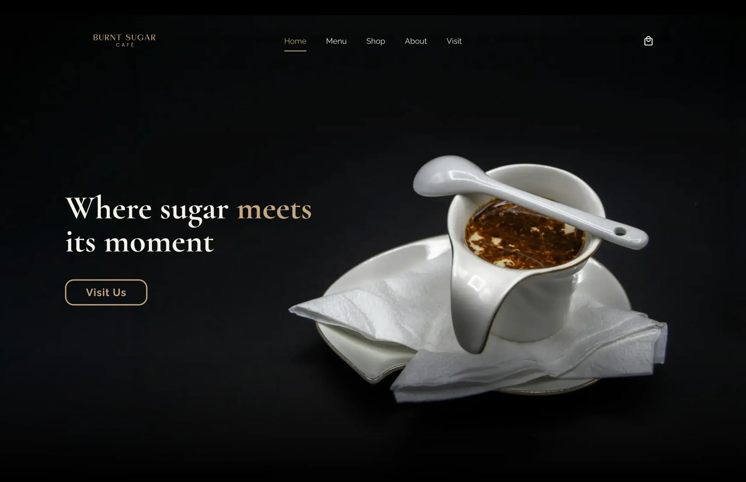
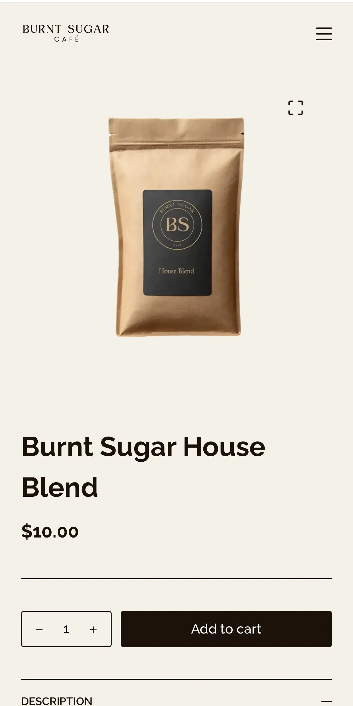
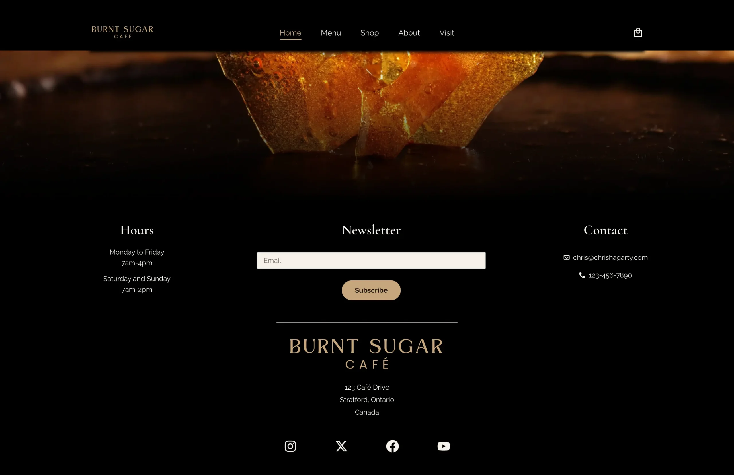
Burnt Sugar Café was my first project built from scratch using a design of my own. Created for a fictional café in Stratford, Ontario, the site includes a full e-commerce store alongside the café’s core content. I wanted the design to feel more dramatic and distinctive, so I developed a darker visual style built around bold typography, rich colours and large hero imagery.
+
Web Design
+
Web Development
The Project
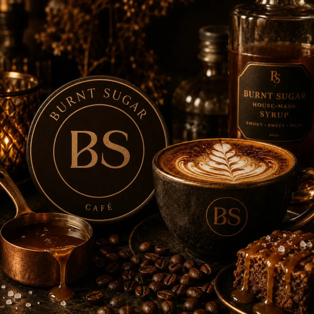
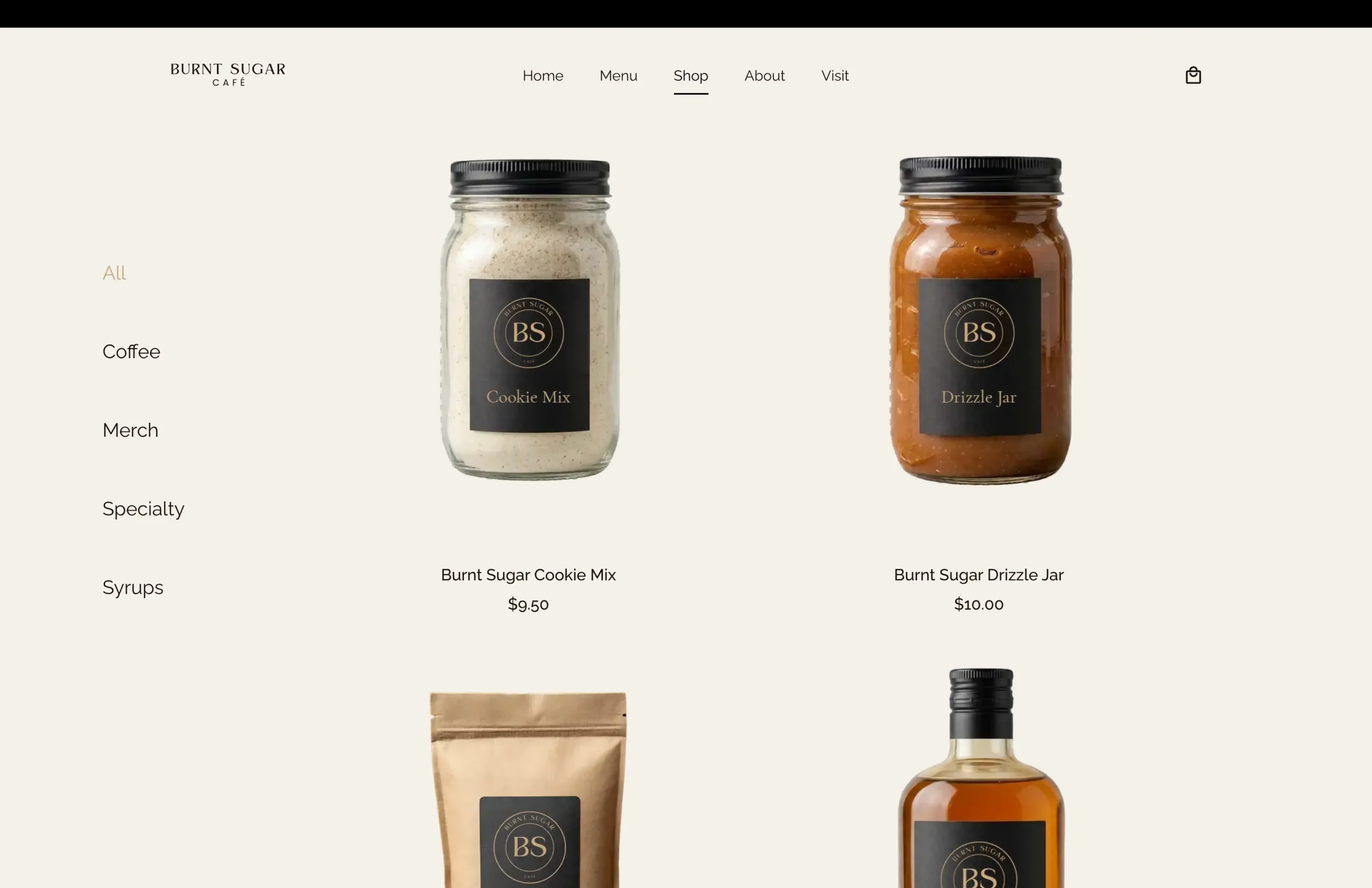
The goal of this project was to build a fully functional website from the ground up while experimenting with more advanced features I hadn’t used in my previous work. I wanted to strengthen my confidence by designing and building the site independently, while also developing my graphic design and branding skills. The result was a complete fictional brand with a distinct colour palette, two logo variations, and a consistent visual identity carried throughout the website.
Design & Development
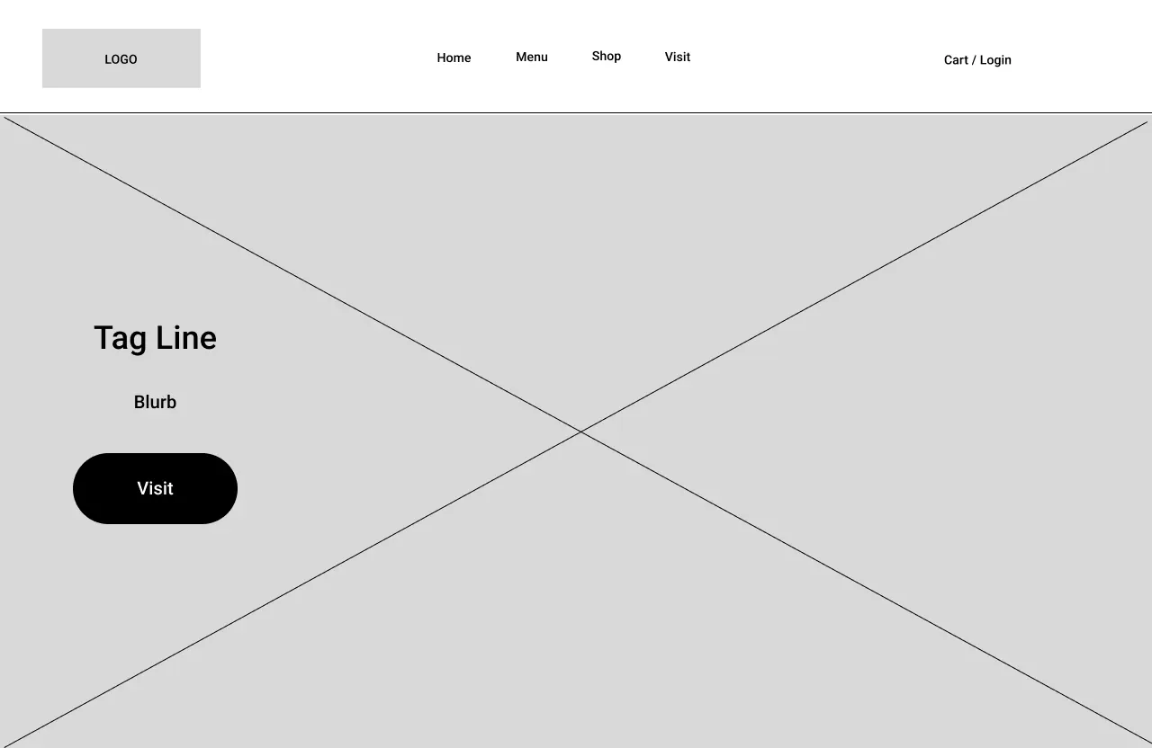
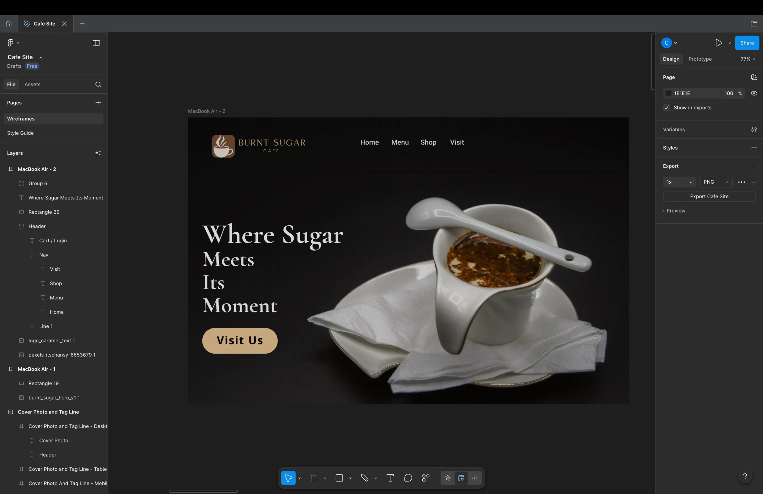
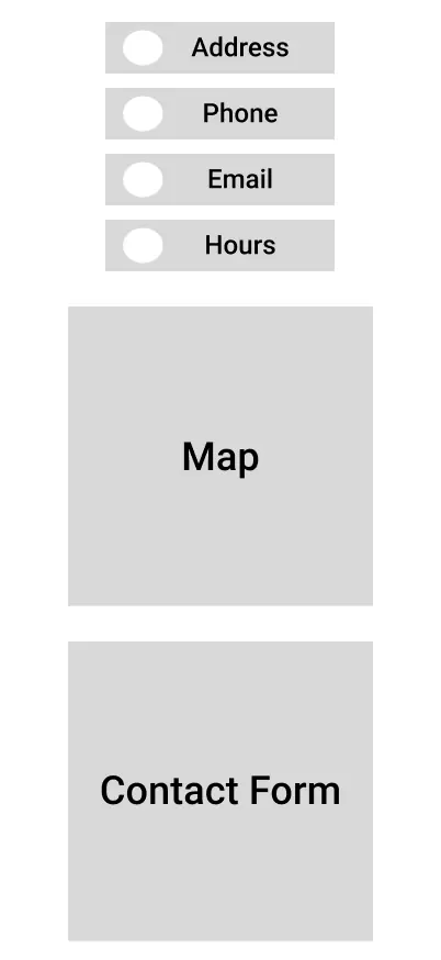
For this project, I used the Blocksy Pro theme, Elementor Pro as the page builder, and WooCommerce to create the online store. I began the design process in Figma, first developing wireframes and then turning them into high-fidelity mockups before moving into WordPress. This was an important step in my workflow because it allowed the development stage to focus much more heavily on implementation, with the major design decisions already established.
The project also gave me valuable experience adapting those designs to the practical constraints of WordPress and Elementor. It helped me better understand where a mockup can be translated directly and where layouts need to be adjusted during development to work effectively within the platform.
Responsive Design
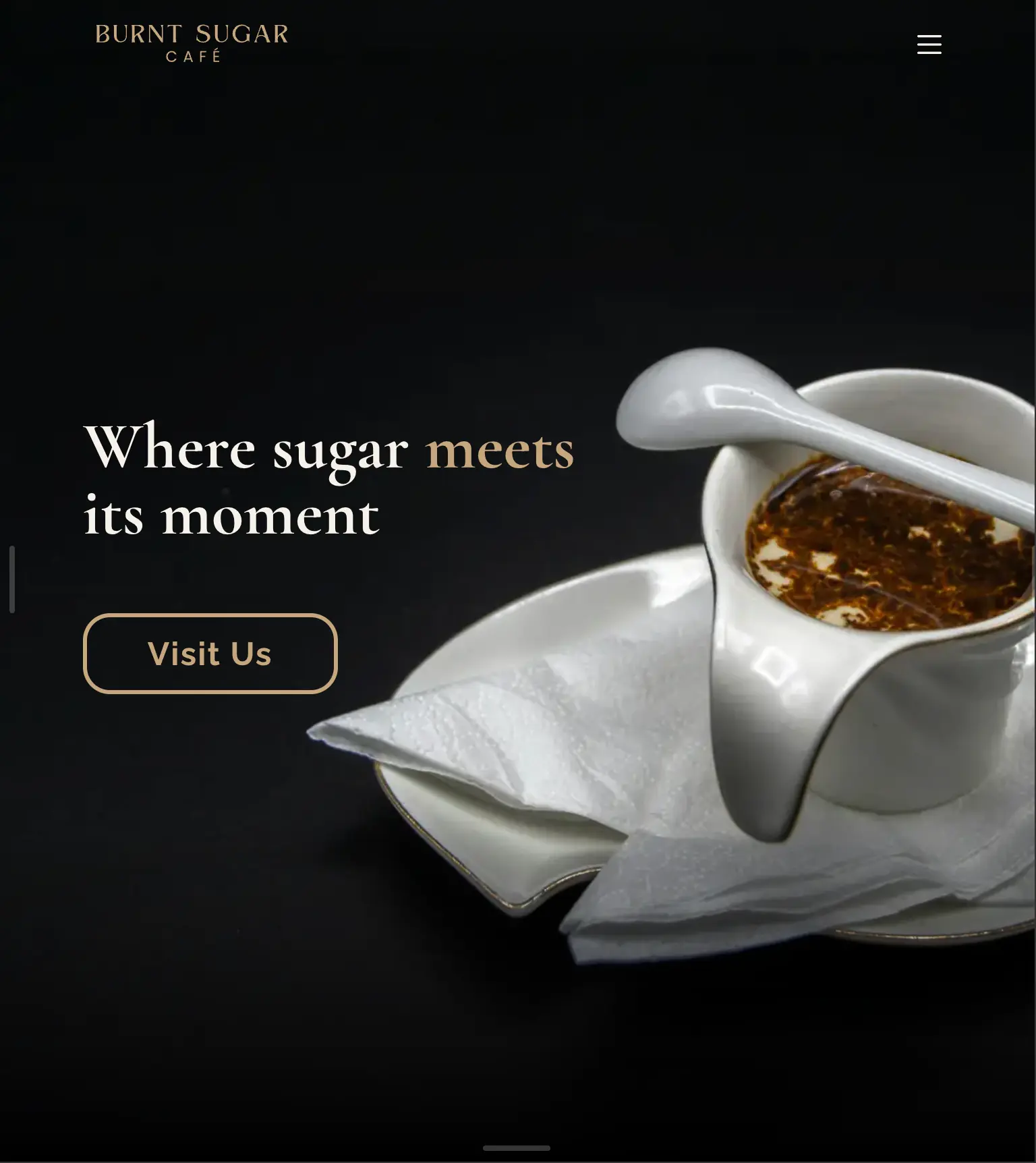
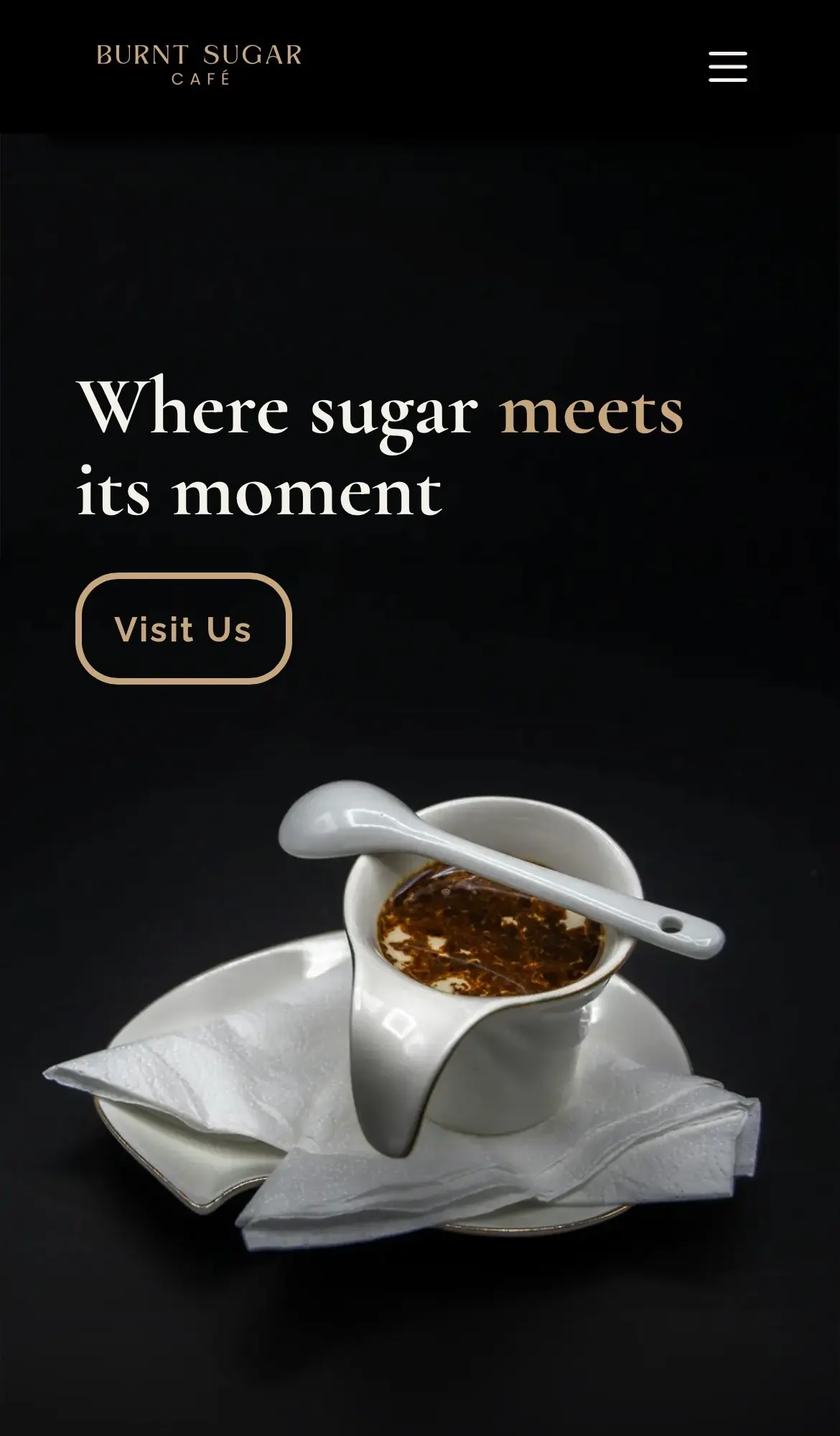
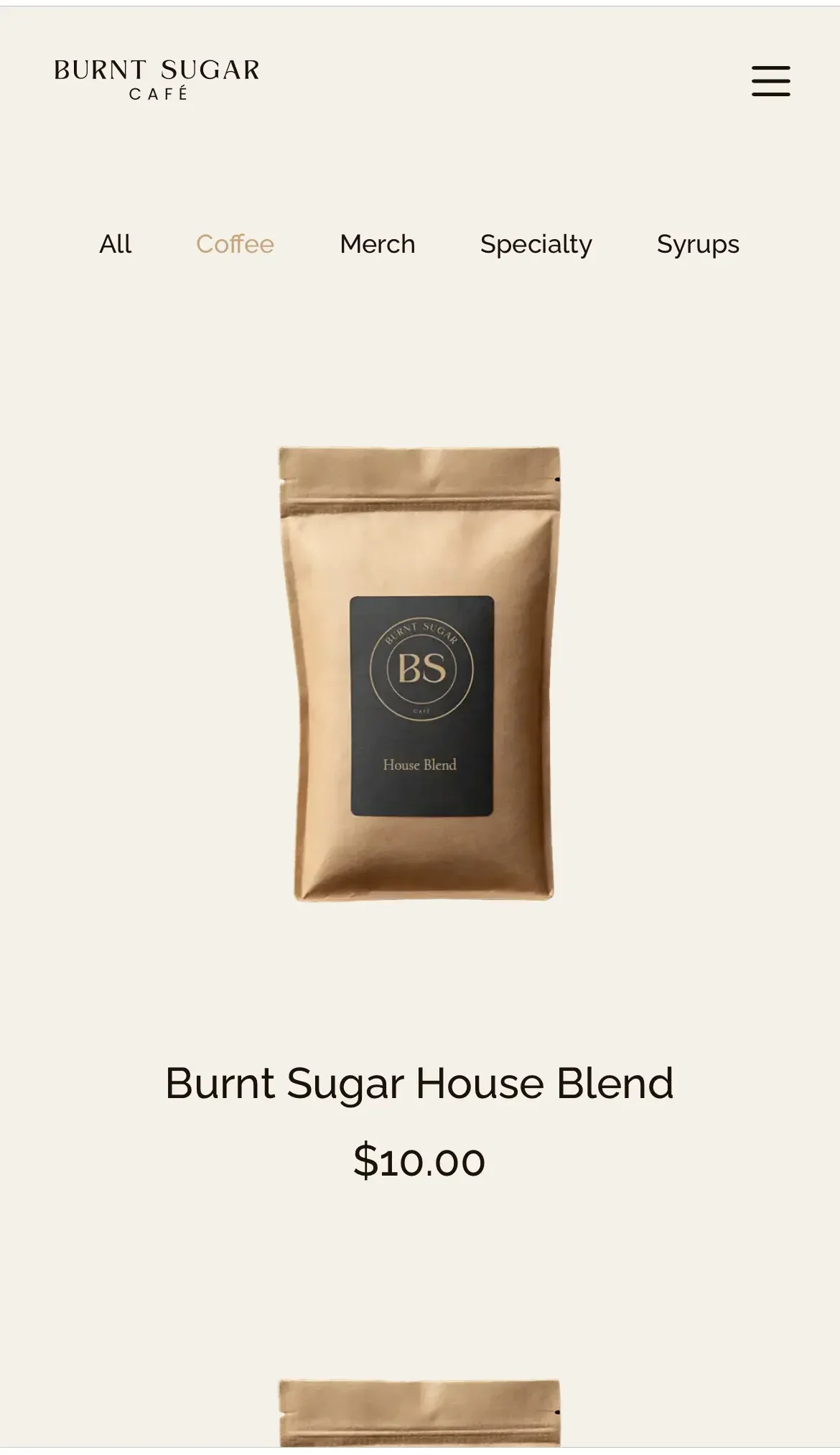
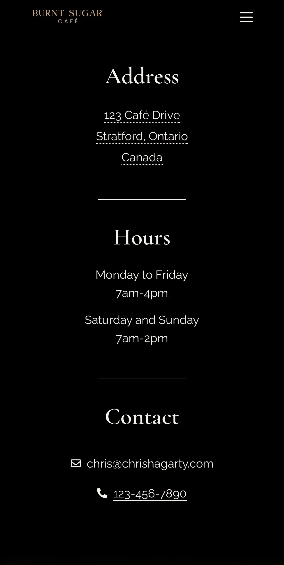
Although most of the responsive work involved standard adjustments such as stacking containers vertically and refining visual details like font sizes, the biggest challenge came from the large hero images used throughout the site. In several cases, they did not translate to mobile screens as effectively as I had intended. For the mobile hero image shown here, I solved that by creating a dedicated mobile version using Photoshop’s Generative Fill, allowing the layout to feel more intentional and better suited to smaller screens.
Design Details
The design details highlighted in this project focus on three key areas of the user experience: the navigation, contact form, and menu. Each provided an opportunity to reinforce the visual identity of the site while keeping the interface clear, consistent, and easy to use.
Navigation
The navigation header became one of the design elements I was most satisfied with. The combination of cream navigation links, a caramel-coloured active state, and the black background created the warm, high-contrast look I was aiming for while keeping the navigation clear and easy to read.
Contact
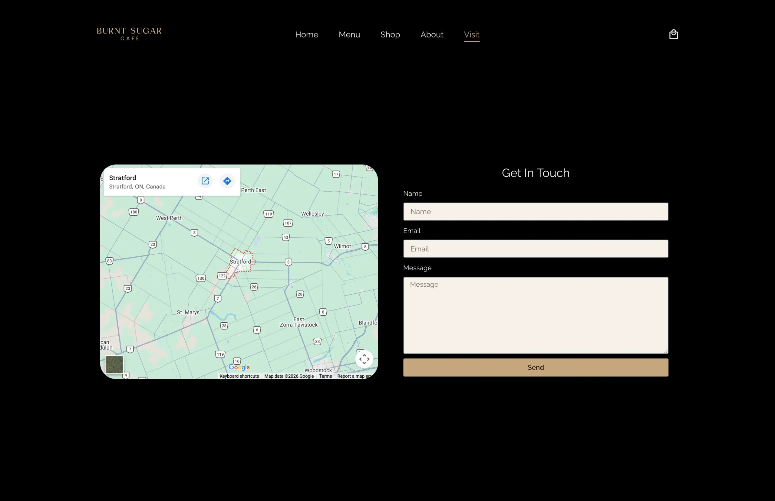
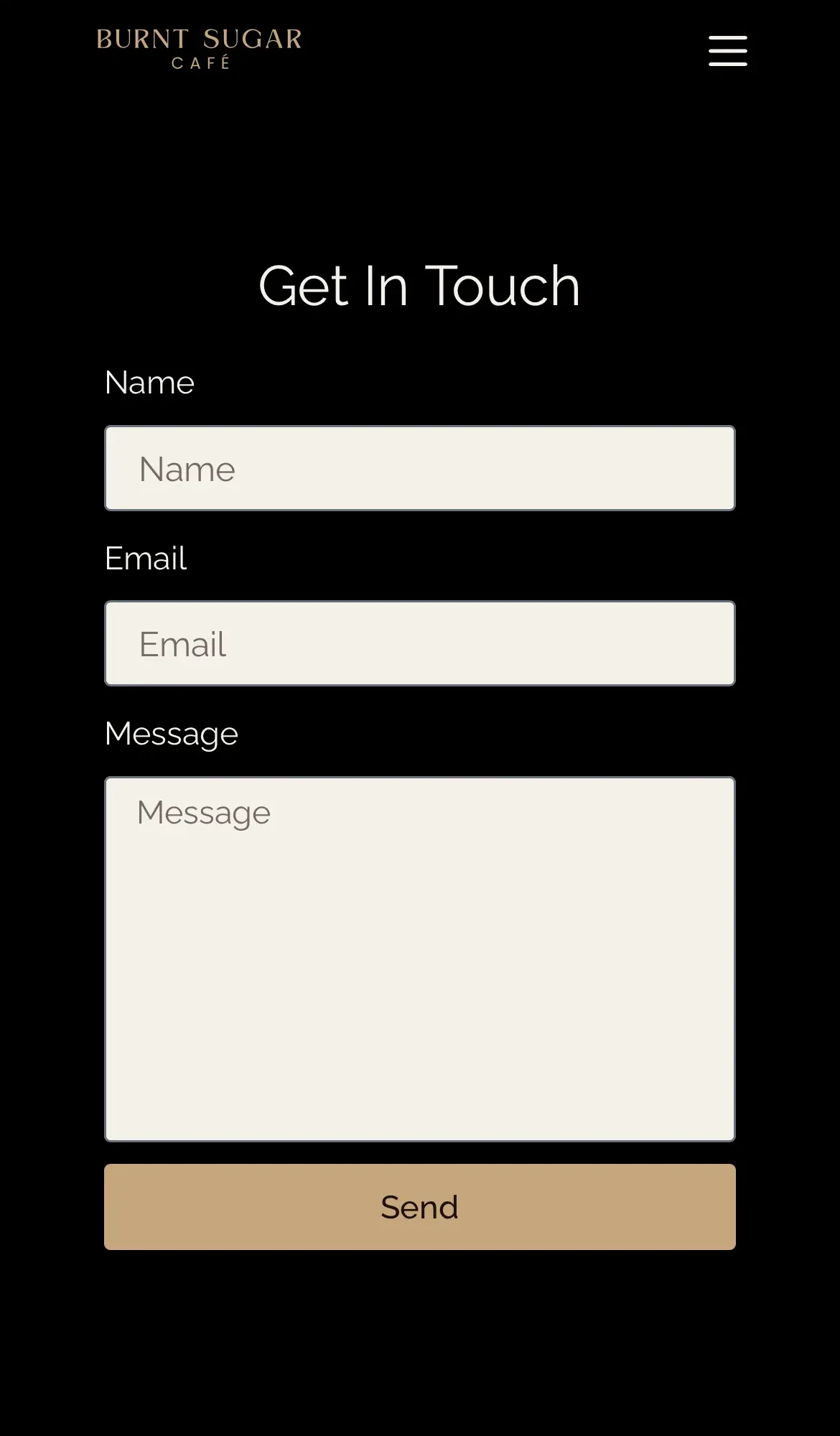
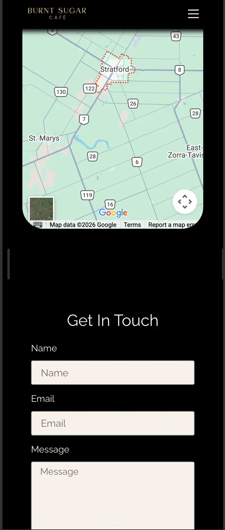
The contact form is located on the Visit page, where it is paired with a map showing the café’s location on desktop. On smaller screens, the layout shifts to give the form more prominence, allowing it to fill most of the available width and height for a simpler, more focused mobile experience.
Menu
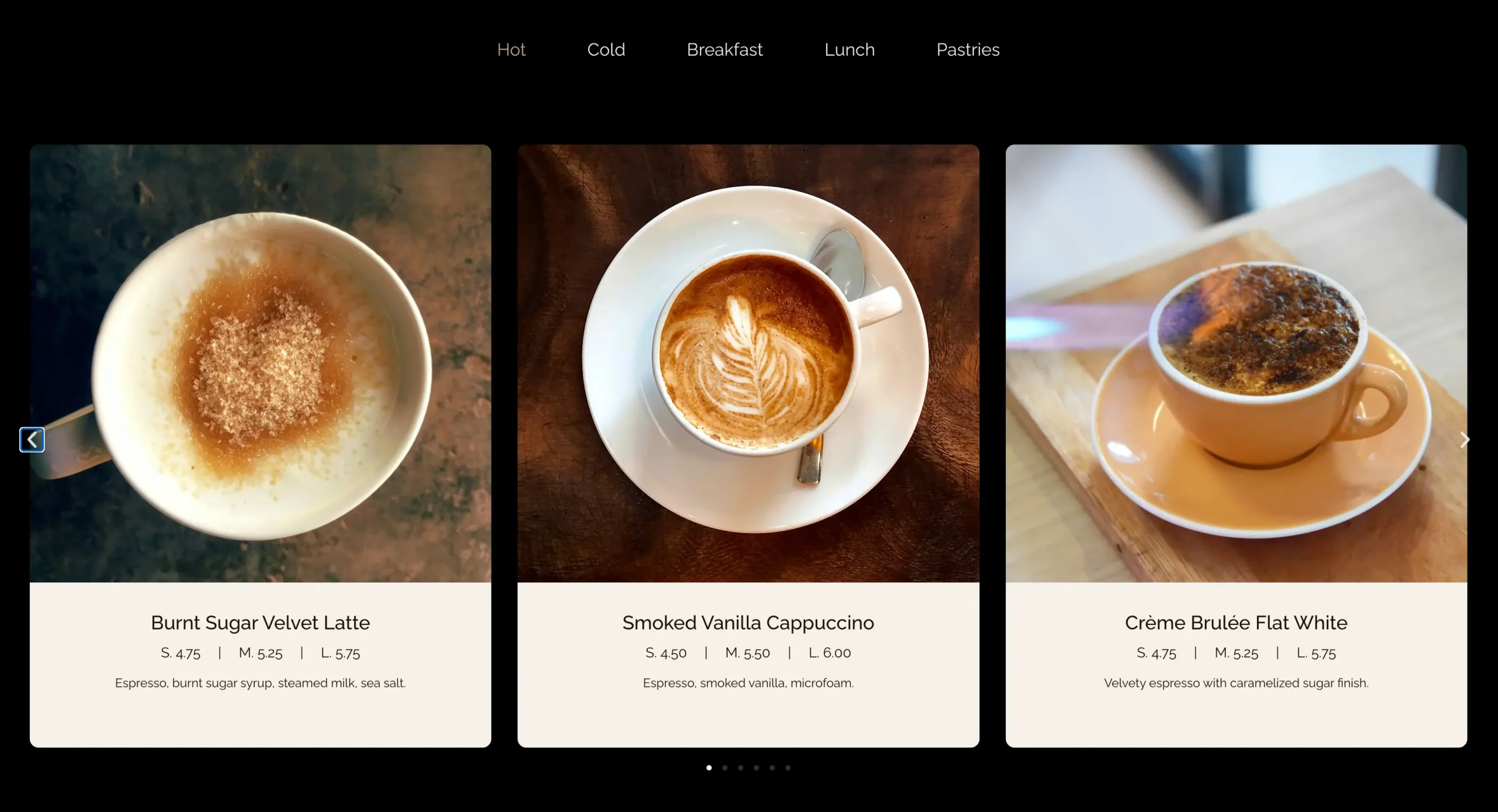
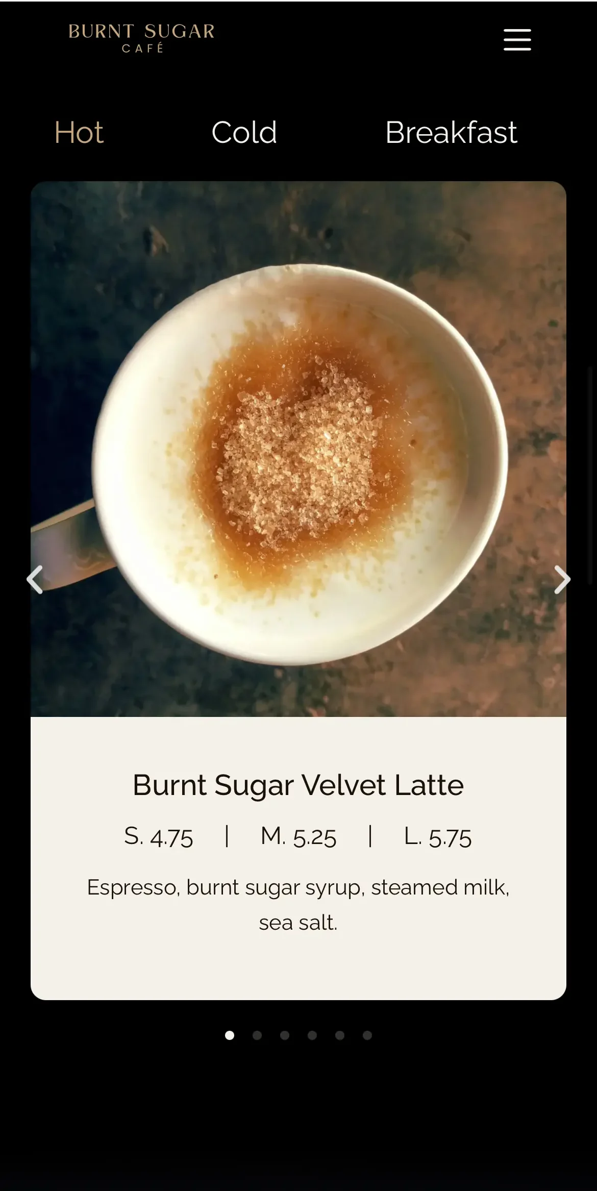
The menu is built from cards that dynamically pull in menu-item information through an Elementor Loop Carousel. The items are organized into tabs, allowing visitors to move between different menu categories without making the page excessively long. This keeps the menu easier to browse while still allowing a large amount of content to be presented in a compact, organized layout.

Outcome
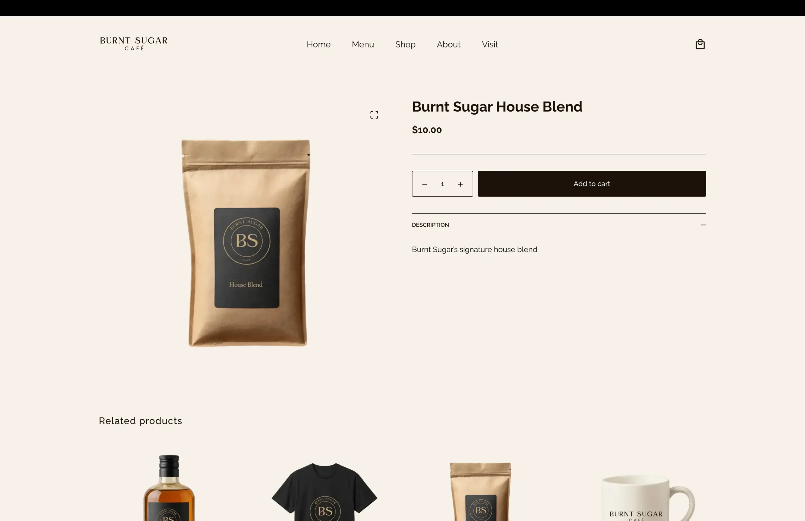
Burnt Sugar Café was a major step forward for me in both web design and development. The project gave me a much stronger foundation in designing with Figma, significantly improved my confidence working with Elementor, and introduced me to building a complete online store with WooCommerce.
Because the original design was created before I fully understood some of the practical constraints of building it in WordPress, the development process also required a lot of problem-solving. Translating the mockups into a functioning site meant adapting certain ideas and finding creative solutions when the original design could not be implemented exactly as planned. That process was challenging, but it was also one of the most rewarding parts of the project.
Have a project in mind?
Whether you need a new website, a redesign, or help improving what you already have, I’d be happy to hear what you’re working on.